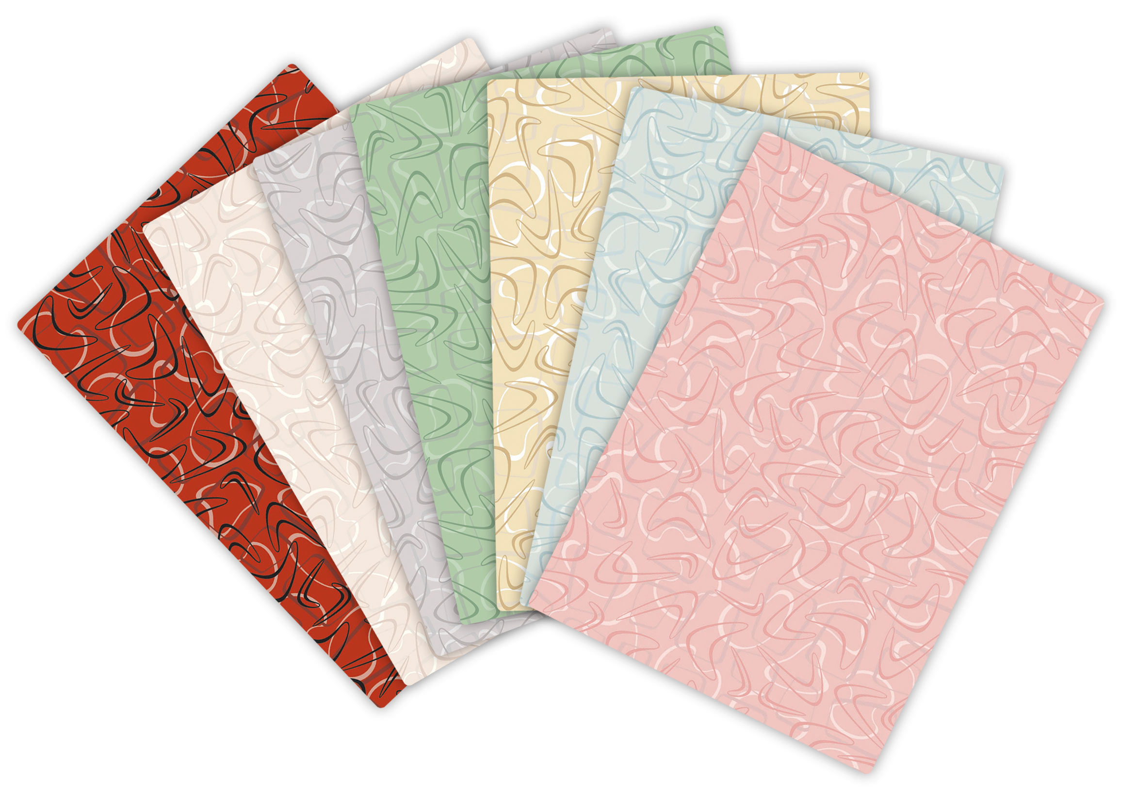
Wilsonart and RetroRenovation.com have come together to create seven new retro colorways for Wilsonart’s Virtual Design Library “Retro” Category Laminate. The colorways were designed to appeal to the growing number of homeowners who want to bring popular colors from the 1940s, 1950s and 1960s into their kitchens and bathrooms.
An Evolution
- Wilsonart already had an established “Retro” Virtual Design Library Category in several midcentury styled patterns and colorways. This retro pattern includes three abstract characters – line-drawn boomerangs intermingled with a loose figure eight and a rounded rectangle.
- To refresh the palette and open the design to more potential uses, Pam Kueber and Kate Battle of RetroRenovation.com envisioned lower-contrast, tone-on-tone colorways that would meld with the most popular midcentury bathroom and kitchen colorways, especially those calling for warm pastels.
- In the new colorways, Pam and Kate wanted to see the boomerang more clearly “floating” on top of these other elements to ensure dynamism, but with carefully controlled contrast.
Setting the Mood
- Pam and Kate compiled design boards that were the influence for each of the colors. The boards included both new products available today in appropriate retro colors, such as tile and flooring, as well as vintage materials, like wallpaper, chalkware fish, hardware modules and even several cabinet doors.
- These products – both vintage and new – reflect what actual renovators might be using or decorating around in their kitchen and bathroom projects today.
- Pam and Kate created collages that would give even more life to the boards and to evoke the happy feeling and vibrant color that retro décor inspires.
Developing the Colorways
- Wilsonart’s design team selected colors for each character of the design to get the right combination.
- A sample was generated and compared against the design boards for coordination. Through each phase of this process, the slightest alteration needed evaluation to ensure a perfect balance of color and contrast.
Laminate samples were sent to Pam and Kate for review. Changes to one layer of any design potentially impacted the whole look of the pattern, affecting intensity or color. The review process took the better part of a year until the seven new retro colorways were achieved.
#gallery-4 {
margin: auto;
}
#gallery-4 .gallery-item {
float: left;
margin-top: 10px;
text-align: center;
width: 33%;
}
#gallery-4 img {
border: 2px solid #cfcfcf;
}
#gallery-4 .gallery-caption {
margin-left: 0;
}
/* see gallery_shortcode() in wp-includes/media.php */
- fan-deck-with-digital-samplesLARGE
- KateSamplesVert1


